LIV Golf Rebrand
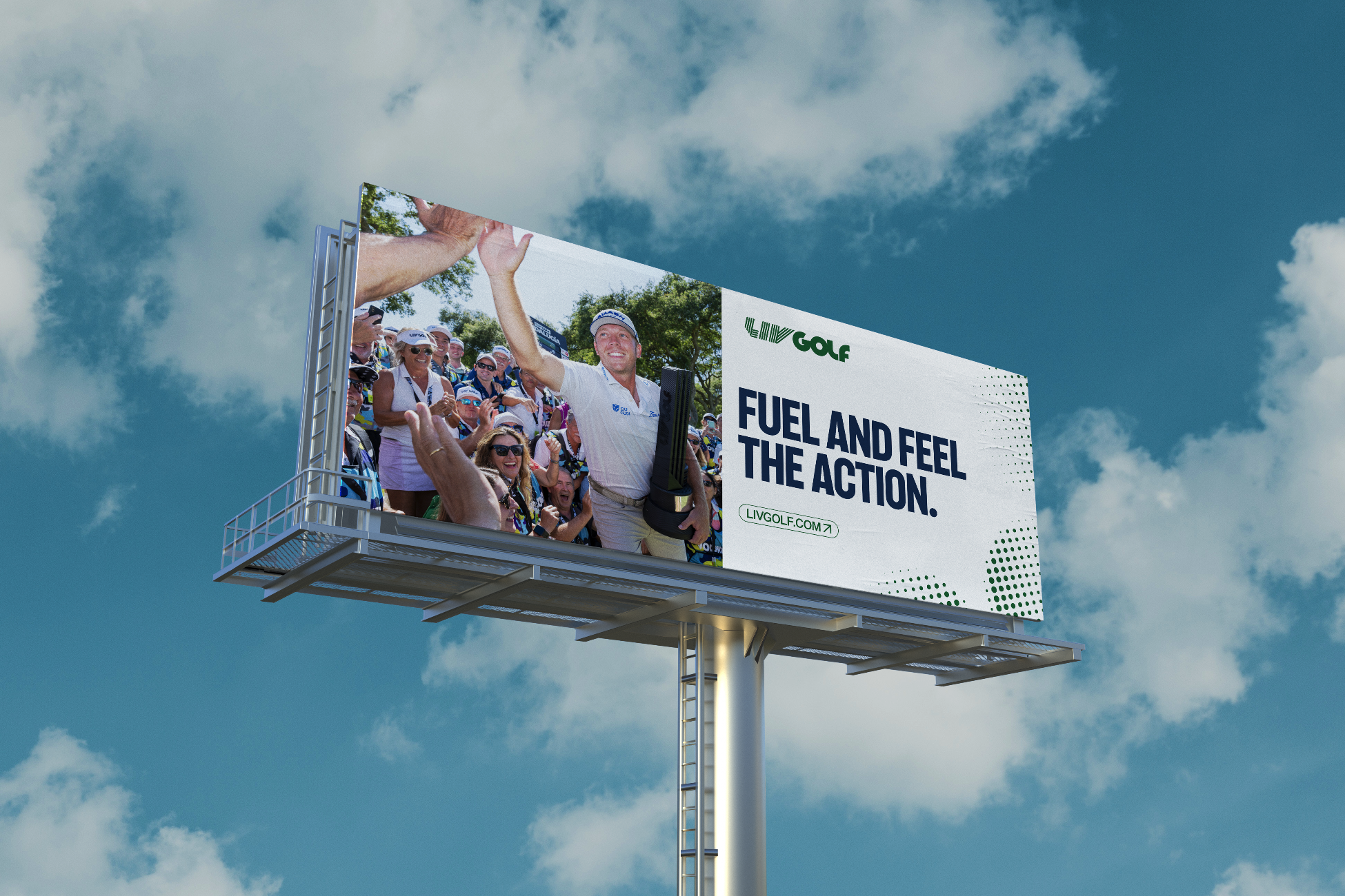
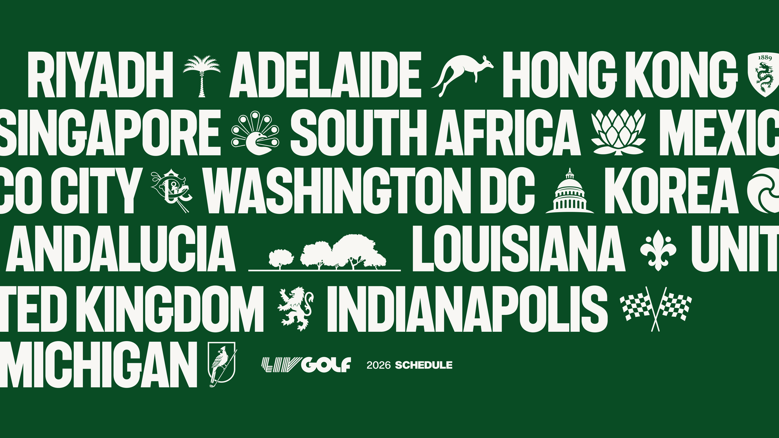
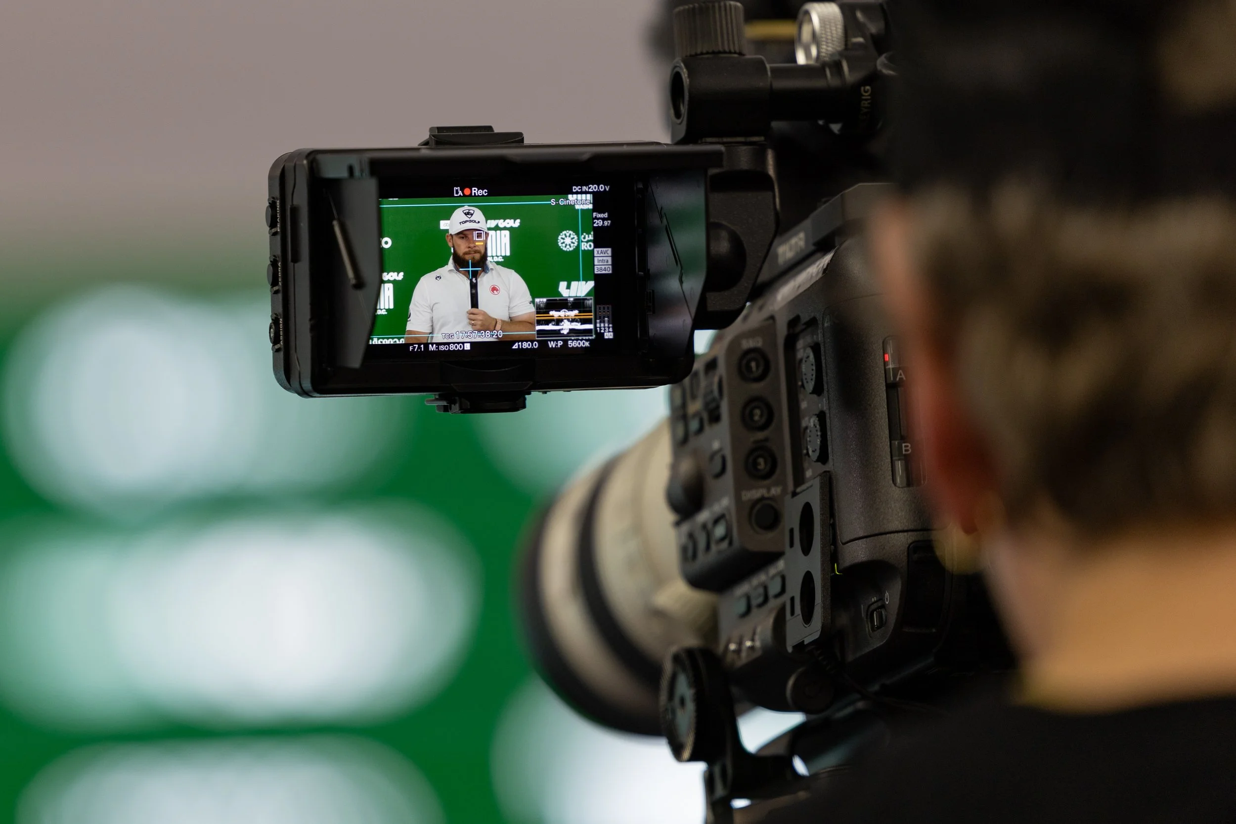
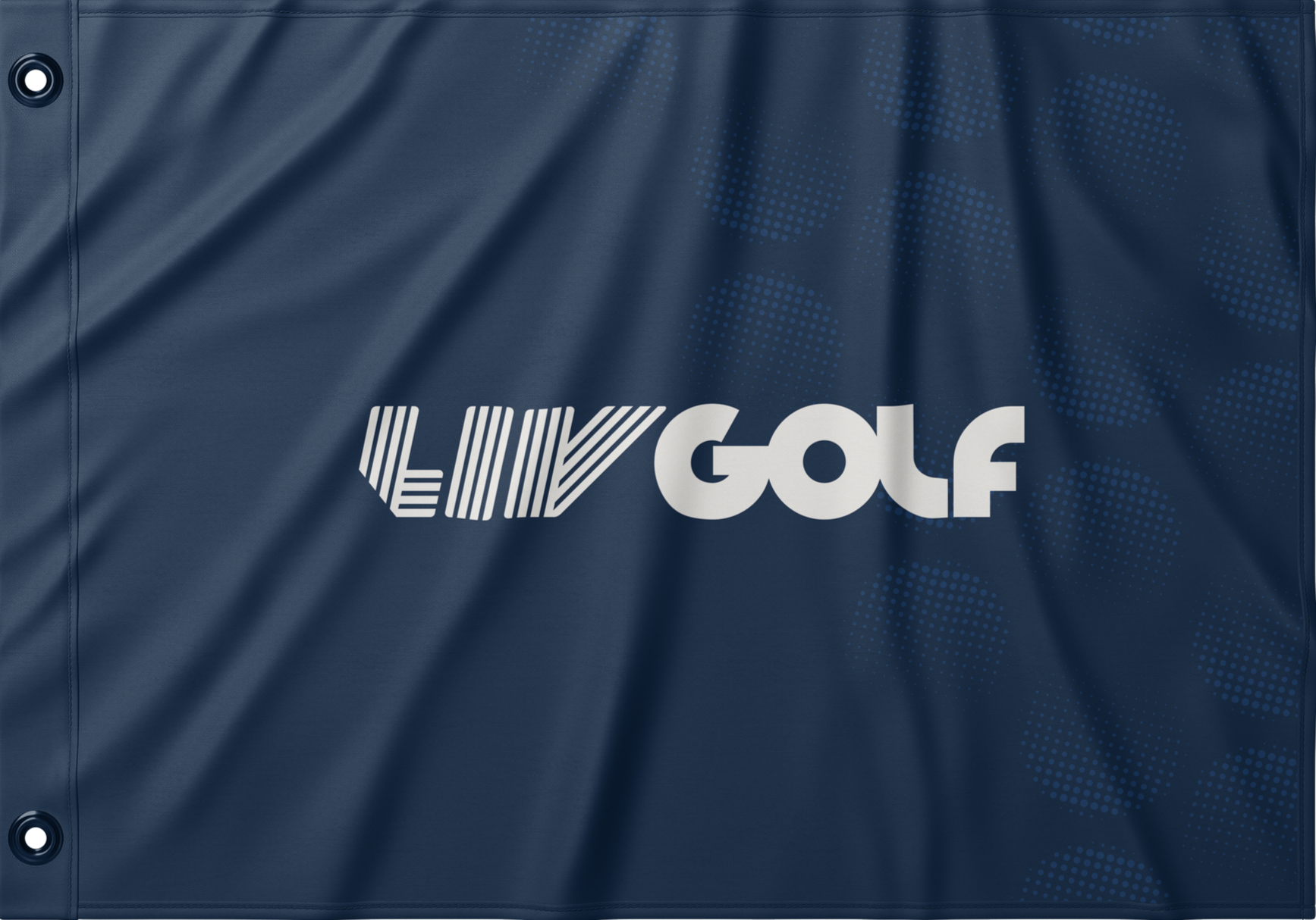
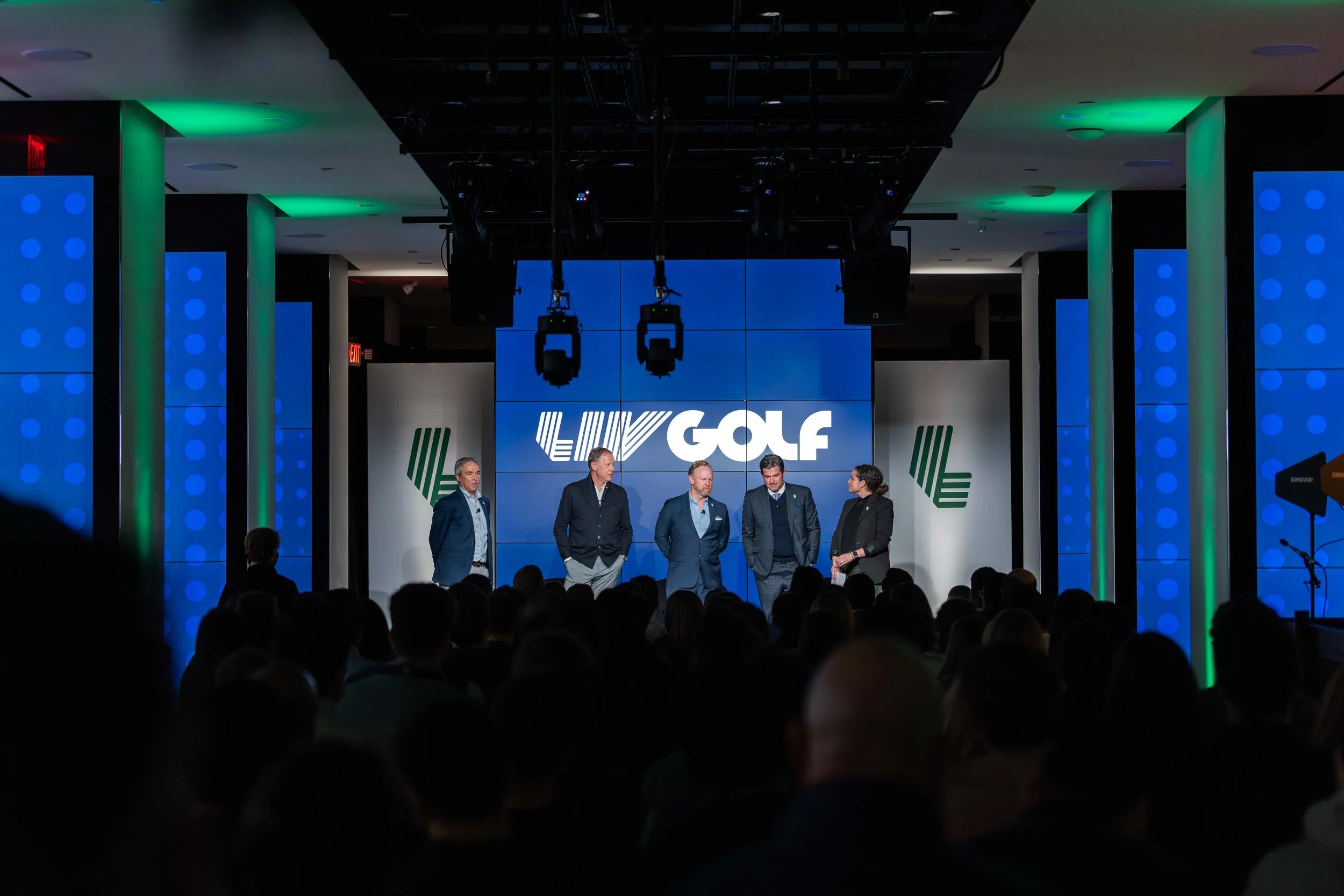
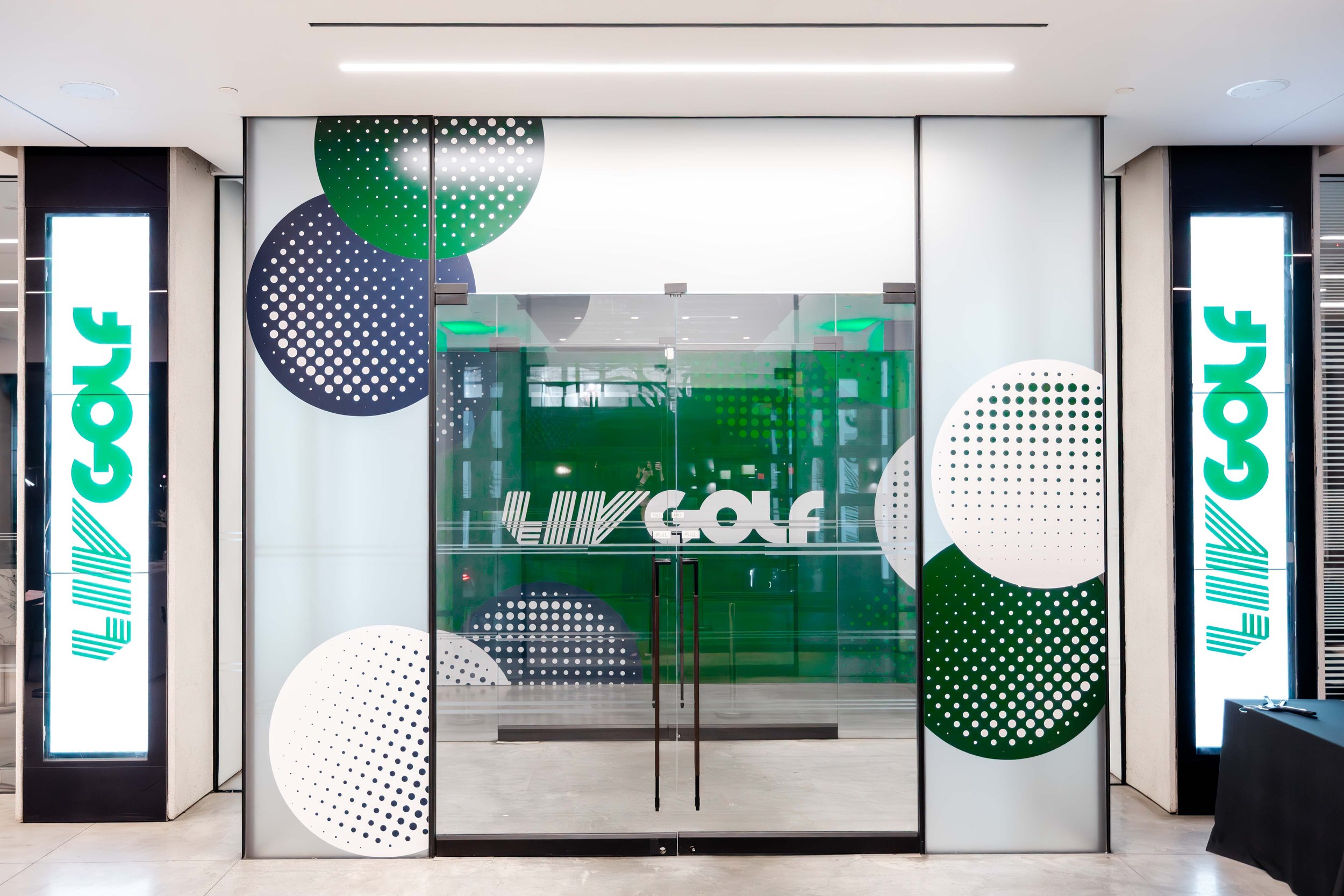
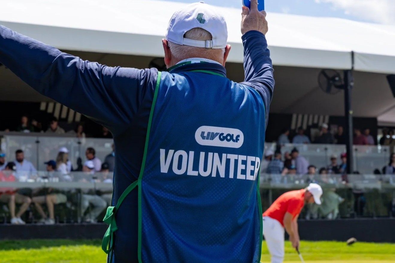
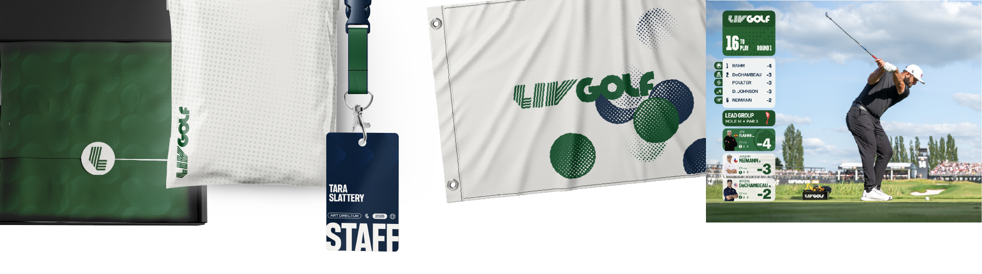
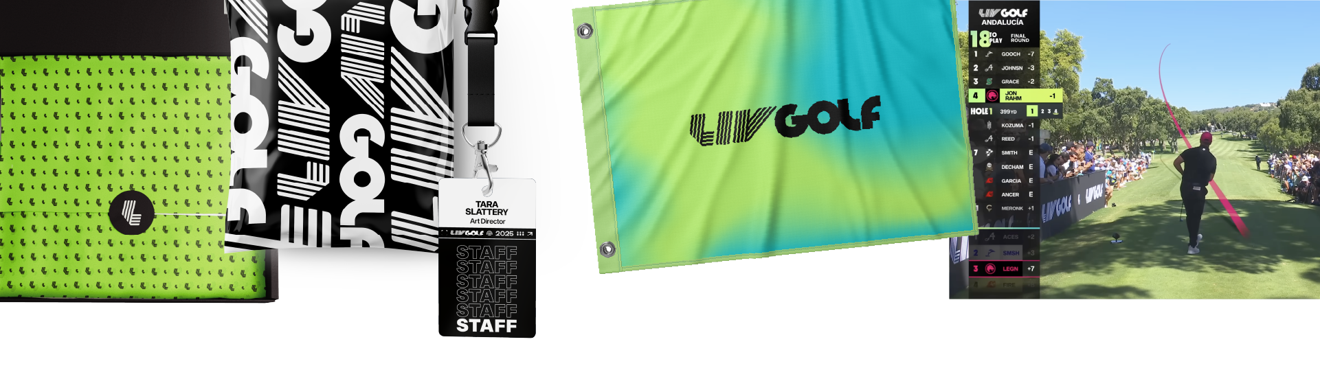
LIV Golf's rebrand was an opportunity to redefine the visual identity for a growing global sports league. I led the creative development of the new brand system from concept through execution, creating the expanded color palette and architecture, pattern library, graphic language, and the principles that guide their application. I also established the foundational design standards used across every touchpoint, resulting in a cohesive, scalable identity that spans digital, social, broadcast, environmental design, merchandise, and live events. The system was built to bring greater consistency, flexibility, and longevity to the brand as it continues to evolve.
Meet the Team





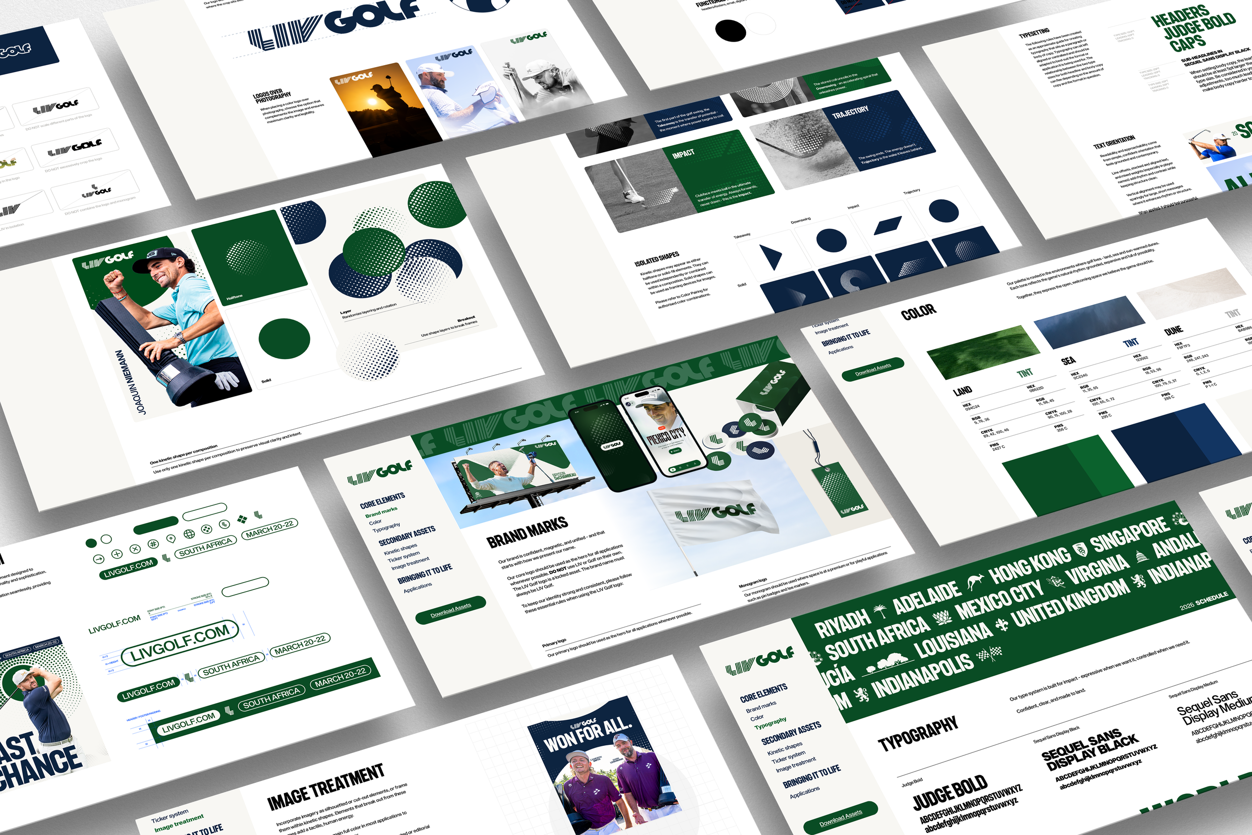
As LIV Golf evolved from a disruptive startup into a global sports league, the brand evolved with it. Guided by the principle stable, not static, the rebrand brings strength through simplicity with a refined visual identity and flexible system built to scale across every brand touchpoint.



The palette is rooted in the environments where golf lives - land, sea and sun-warmed dunes. Each tone reflects the game’s natural rhythm: grounded, expansive and full of possibility.
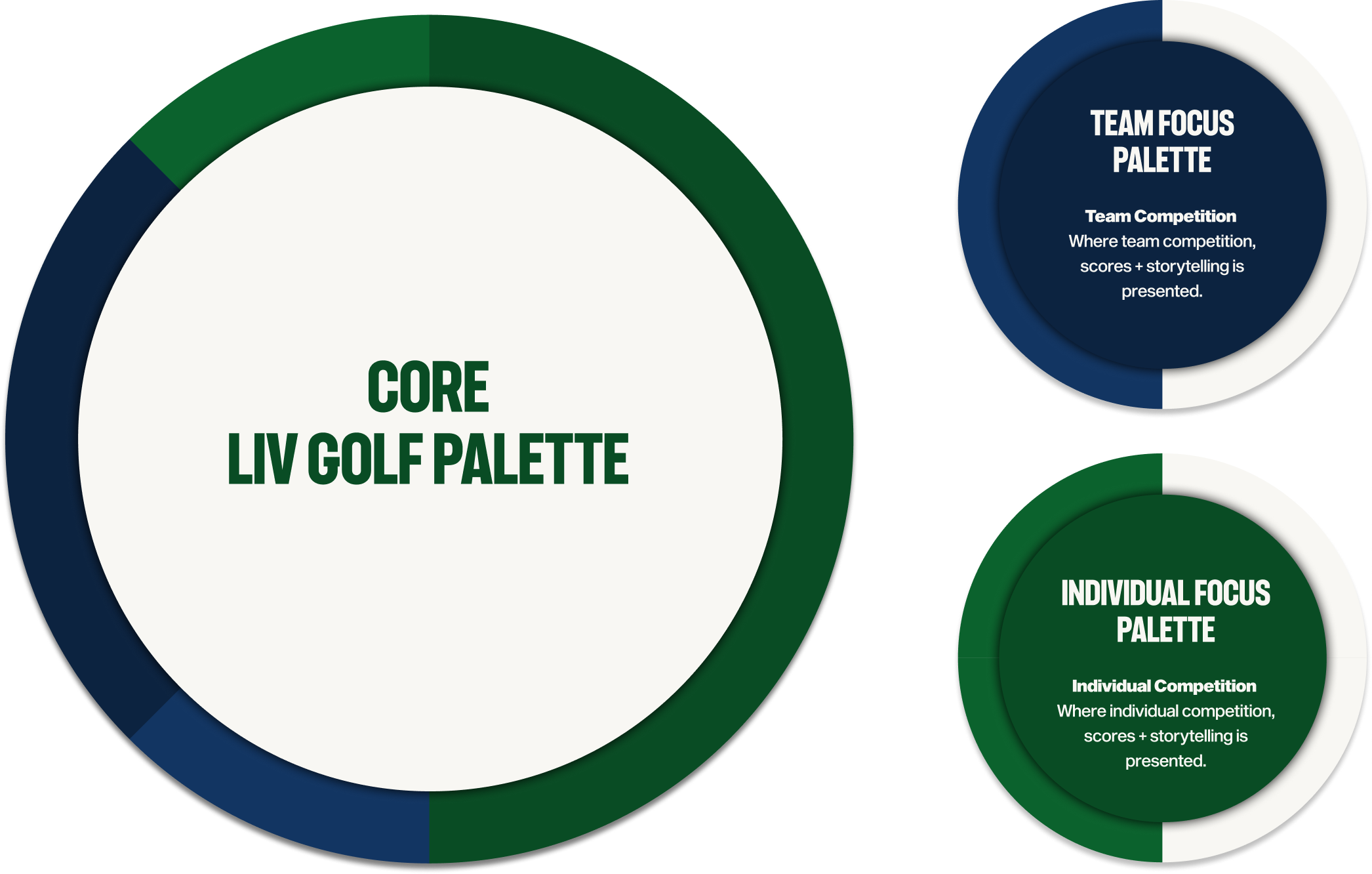


Rather than applying color stylistically, the system used color to define context. League moments were expressed through a tritone palette, while duotones signaled more focused player and team narratives, creating consistency across every touchpoint while strengthening the story behind each piece.
The dynamic leaderboard below shows the system in action, using these distinct color treatments to clearly differentiate between individual and team competition.

The Kinetic Shapes are core elements of the brand’s visual system, inspired by the natural motion of a golf swing. Takeaway, Downswing, Impact, and Trajectory each capture a distinct moment of movement, bringing energy, rhythm, and forward momentum to the identity.